Portfolio
I have been working with clients on information design and data storytelling/visualization projects for over 25 years. This includes governments, NGOs, and commercial enterprises across just about every industry. Here are some recent examples of my work.

The charitable giving of Yield Giving from 2020-2022 depicted as an illustration focused on the incredible volume of grants (1600+) and the fact that the vast majority of them went to singular organizations. But there are large clusters that went to individual chapters within larger organizations like Habitat for Humanity, United Way, Boys & Girls Clubs, and more.
Are your Olympic dreams over once you turn 50? This was the question I wanted to (selfishly) answer. And, it turns out, the answer is “no” but a heavily caveated “no”. You can see what the data says in the scrollytelling experience I created.


In honor of International Coffee Day, and since I had explored this data from the International Coffee Organization as part of curriculum development for my Big Four training client…I couldn’t resist making this fun visual. Seriously, Luxembourgers are bananas about coffee.
It’s really hard to relate to 400,000 deaths. And as my frustration and anger grew throughout 2020 about how the pandemic was being handled (or not), and what the end result was, I felt compelled to try to communicate that impact. This animation is more of a “data art” piece than anything else. It is clearly opinionated, highly political, and therefore it is art/commentary, not anything resembling “journalism” or “research”.


The 2020 election is fraught with confusion and complication due to the nature of the electoral college, the COVID-19 crisis, Trump’s unfounded claims about voter fraud, and more. This project explores some of the numbers and explains why it’s so important to vote early this year, and in person, if you can.
By the end of July, it was inevitable that COVID-19 would surpass Accidents as the #3 killer in the U.S. in 2020. The only question was when…and whether it would eventually crack the top two. This visual became my first viral (no pun) success when it made the front page of Reddit and racked up 25K+ upvotes and 1500+ comments.


The nickname for my home town’s sports teams is “The Hillers”. It’s very hilly. So running around here can be challenging. One day when I was running, I paid attention to what was going on in my mind and how it correlated to the slope of the hill I was on. I made this for fun that day.
Systemic racism is clear based on the fundamental disparity between a variety of measures and the population distribution of black people in the U.S. This data story looks at victims of police killings in the U.S. through that lens. It doesn’t answer the “why” questions, but does point to clear evidence of a problem worth solving.


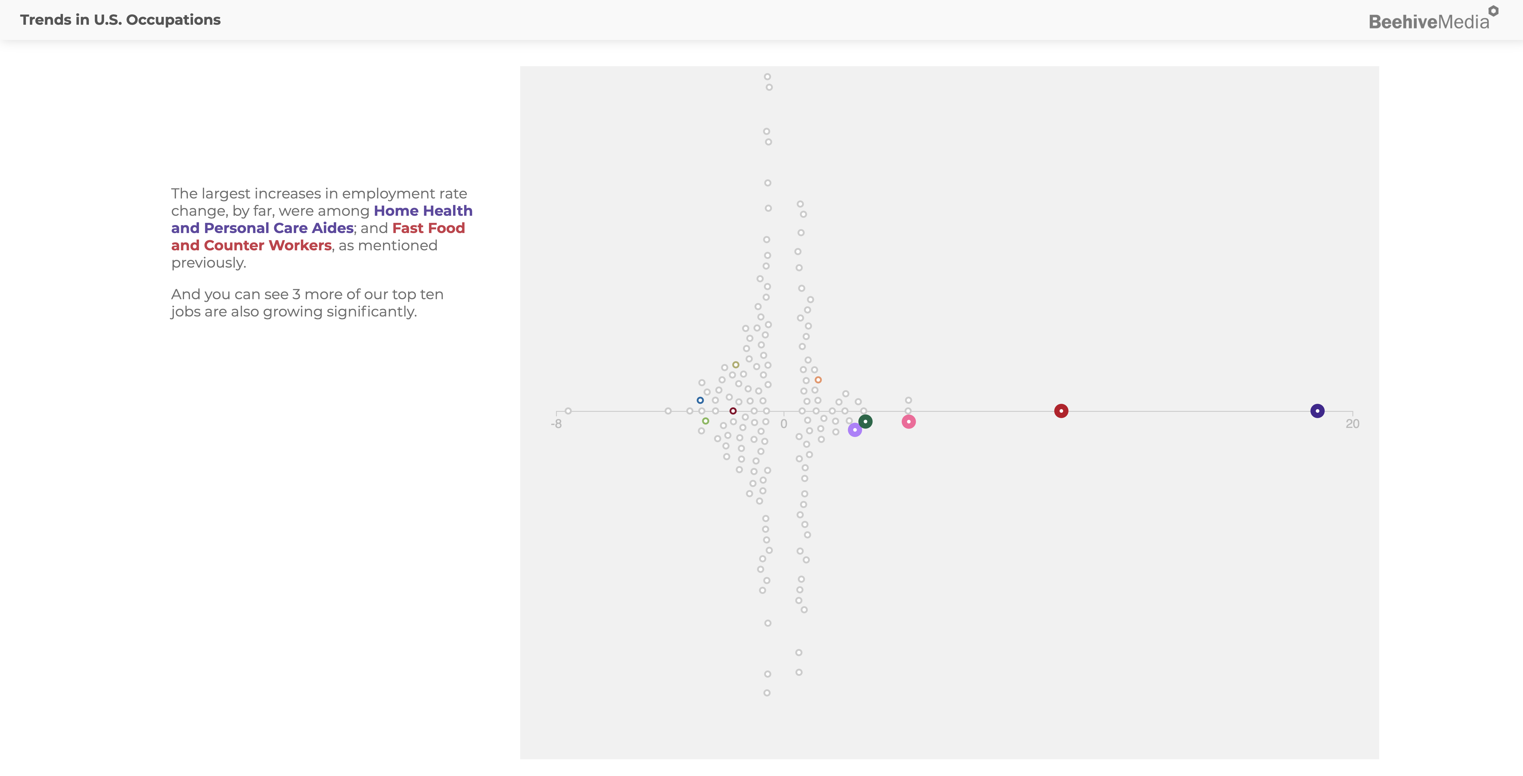
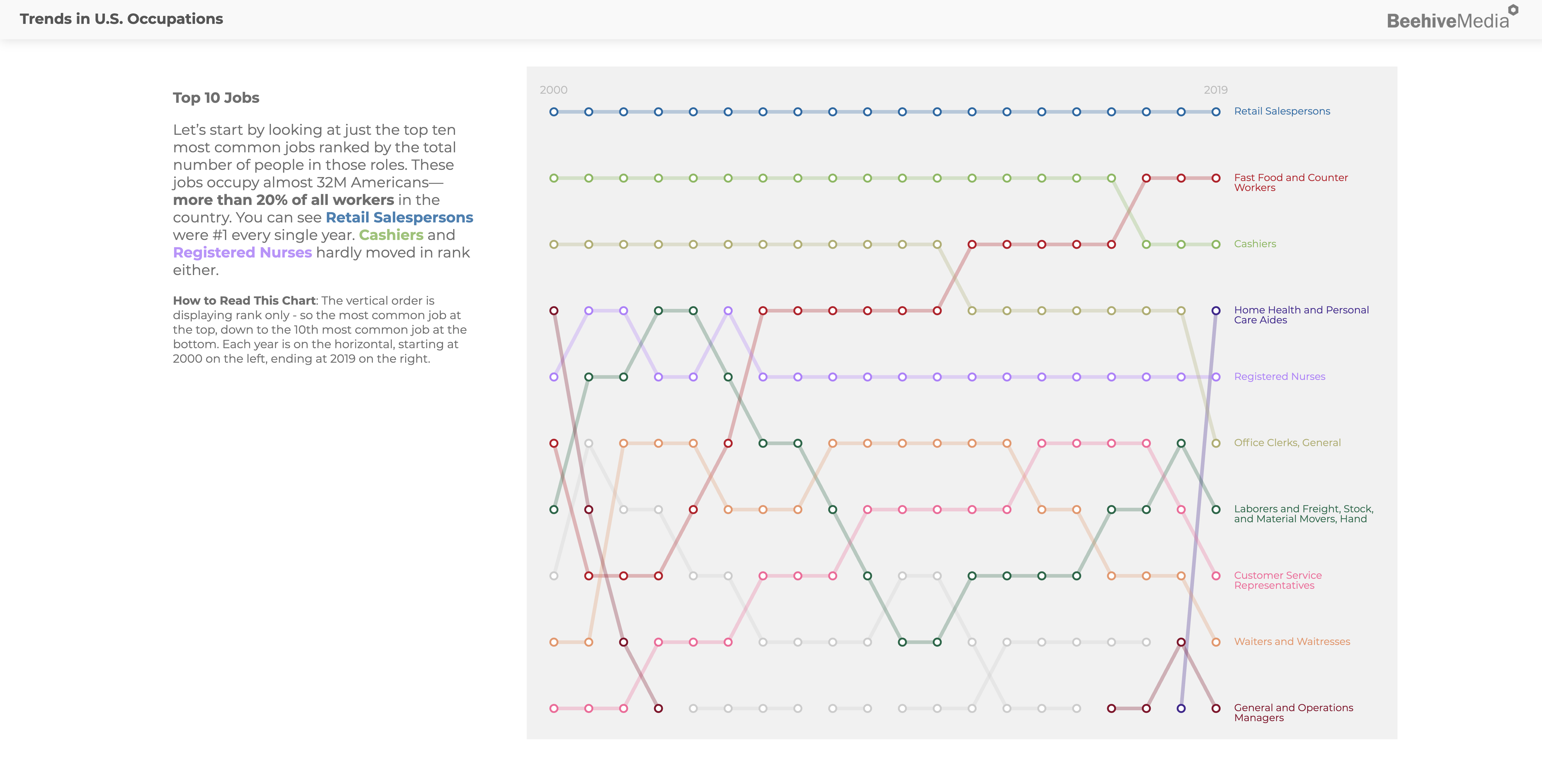
Jobs change over time due to technology, cultural trends, government policies, and many other reasons. Seeing how the jobs market is changing tells us a lot about our country, and where we’re headed. This project explores changes in U.S. occupations from 2000-2019.
I have done a series of concept and data visualizations for MIT’s Center for Information Systems Research. This includes graphics and animations for professors Peter Weill and Stephanie Woerner’s book “What’s Your Digital Business Model?”, and a variety of other projects for promoting CISR books and initiatives. A few examples are in this short animation.
We live in a QWERTY world, for a host of reasons. But other keyboard layouts exist. Which is best? I explored this question in a data storytelling format as a side project.


AlixPartners, like so many consulting firms, conducts research to develop expertise in its clients’ industries, which it also uses for thought leadership marketing. I created a series of static infographics for several of their reports. This one, focused on IT Investment patterns, shows a striking shift in how the most successful companies invest in IT compared to their less-successful competition.
The FM Global Resilience Index is the first data-driven tool and repository that ranks the resilience of 130 countries and territories according to their enterprise resilience to disruptive events. It is designed to help executives evaluate the countries they rely upon so they can make more informed decisions when it comes to their own business and supply chain resilience. In addition to the public country index, clients of FM Global can see their own company’s resilience index score and benchmark against competitors.


The Boston Public Schools system hired architecture firm SMMA to conduct its 10-year master plan to evaluate the quality and longevity of the 130+ facilities in the district. This massive undertaking generated a lot of data. The BuildBPS dashboard is a collection of visualizations of that data to help the city, school administrators, make informed decisions about the future of the school system.
Anna Karenina has one of the greatest opening lines in all of literature: “Happy families are all alike; every unhappy family is unhappy in its own way.” This infographic explores happiness and love of the four key characters in this novel. You can see it in full-size, along with an explanation of the thinking behind it, as well as a post about how this was made.
